A food truck chain of twelve trucks found in Sweden’s major cities.
Name: Meat & plant
The customer wants to balance between communicating the high quality of the food while being
okay with it being a bit sloppy - like fast food should be.
Restaurant quality but uncomplicated.
High quality, foodie/food enthusiast, exclusive, high level of craftsmanship, small-scale
To offer a classic fast food menu but of absolute restaurant quality, fast, simple and
convenient
Always seasonal and organic, whatever you order.
Foodies, food bloggers and content creators - a small customer group with a big impact on social
media.
Values craftsmanship, presentation, customer experience in all aspects.
Young, urban, has social media in their blood.
A hamburger with fries and dressing costs 219 SEK, and the proportional price range is reflected
throughout the entire range.
In addition, there is local beer from the town’s small independent breweries.
You can become a Meat & Plant patron, a membership club which gives a 20% discount per purchase, and once a quarter you receive Meat & Plant’s publication with recipes, portraits of their suppliers, essays about food - the craft, the community, the traditions.
Food enthusiasts, relatively young 30-55 years, with relatively good finances, who do not hesitate to pay for food of good quality. The typical market hall visitor or food traveler, where the interest in food is part of the own identity. Follows the aforementioned foodies/content creators on social media, and is influenced by them.
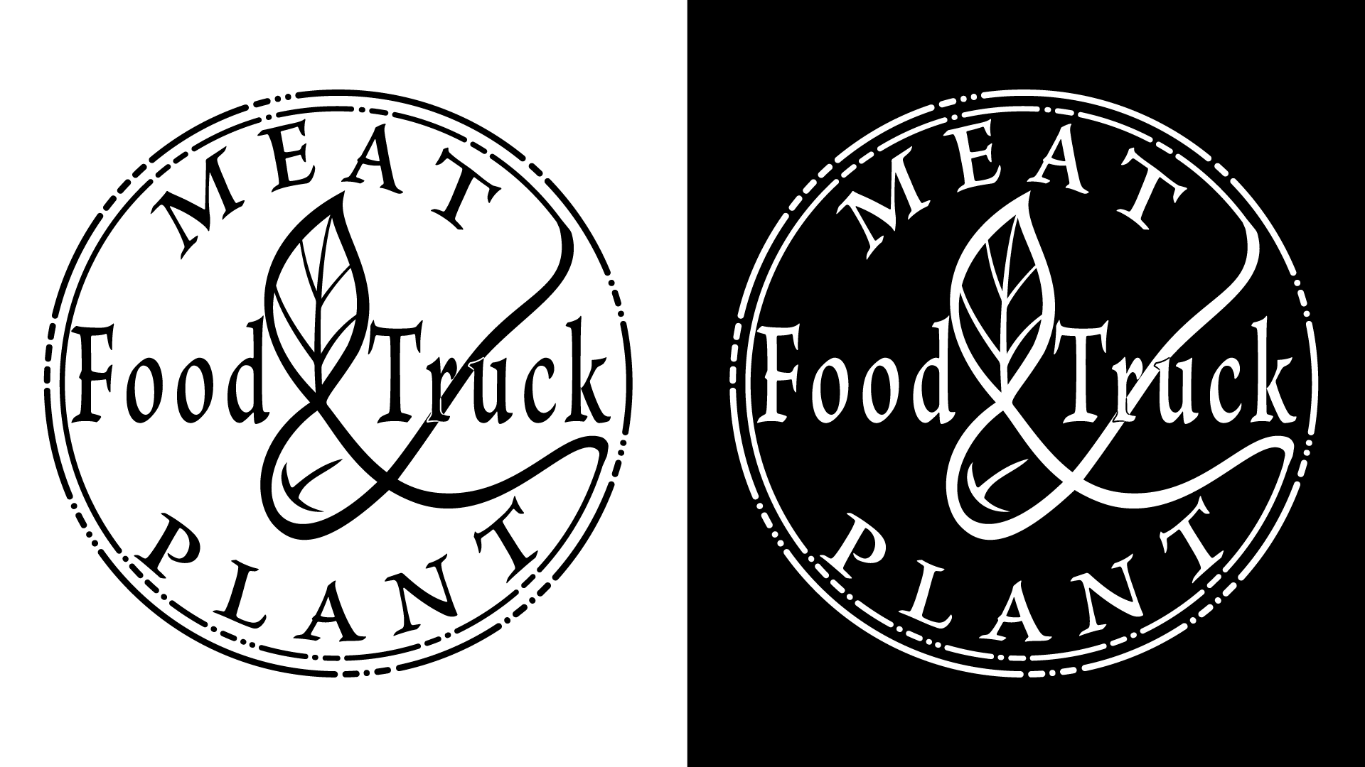
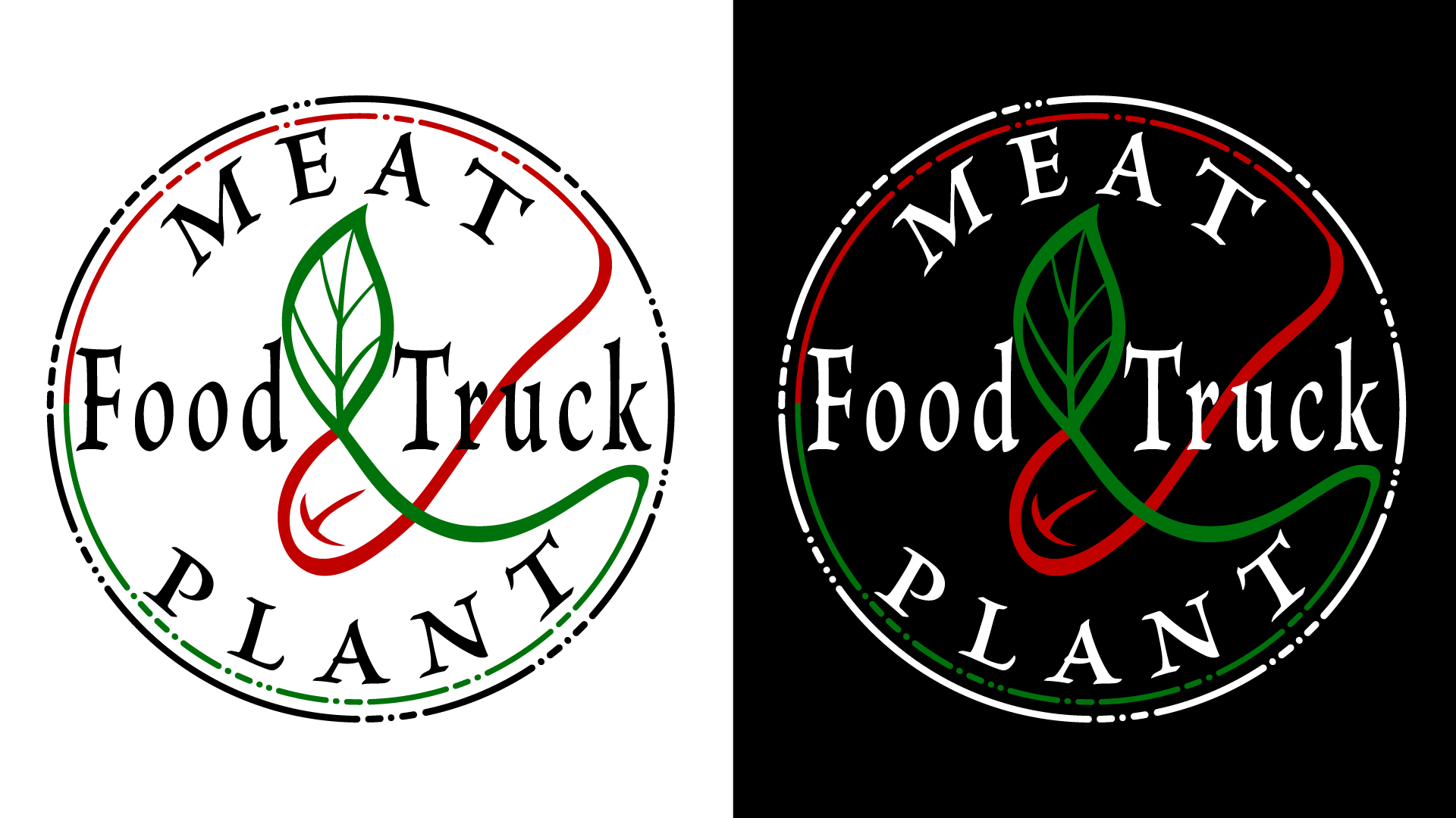
Logo
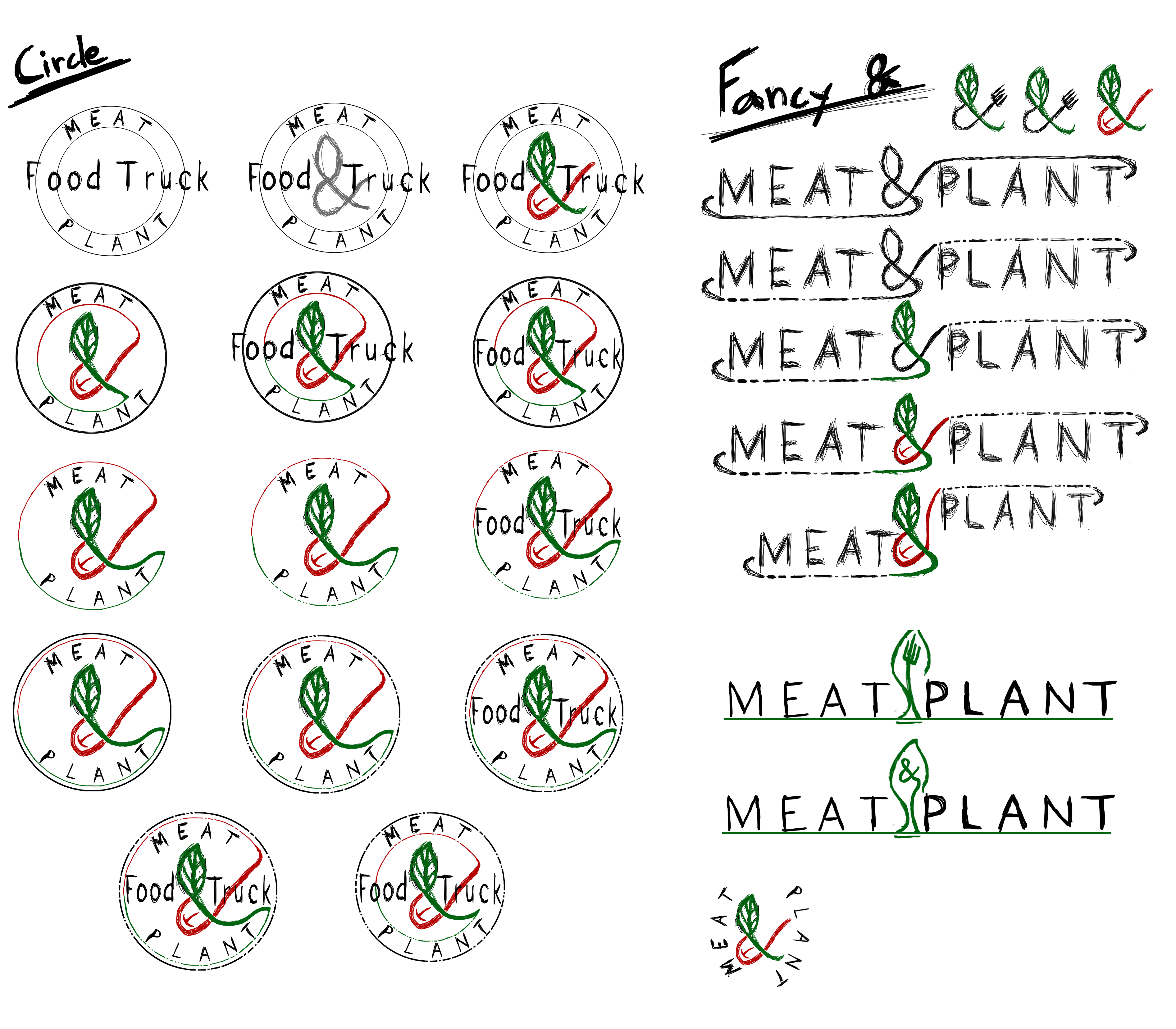
Mockups/sketches of
Mockup on a website
An “issue” of Meat & Plants’ publication
Morsecode added as a fun easter egg for those who pay enough attention.
| . _ _ . | . _ . . | . _ | _ . | _ |
| P | L | A | N | T |
| _ _ | . | . _ | _ | |
| M | E | A | T | |
| . . _ . | _ _ _ | _ _ _ | _ . . | |
| F | O | O | D | |
| _ | . _ . | . . _ | _ . _ . | _ . _ |
| T | R | U | C | K |
I chose a round logo because rounded logos are often used for more exclusive logos. They are more compact and look better on things like mugs and packaging. This is important because of the main target audience, as they would be posting pictures of the food and packaging. An oblong logo risks not being seen well from multiple angles.
The colors were pretty obvious with green for “plant”, and red for “meat”. Green is also a color associated with freshness and organic and red with appetite
|
Hex : #c10000 RGB: 193, 0, 0 CMYK: 0, 100, 100, 24.3 HSV: 0, 100, 76 |
|
|
Hex : #00720b RGB: 0, 114, 11 CMYK: 89, 29, 100, 20 HSV: 125, 100, 44 |
Brioso Pro
ABCDEFGHIJKLMNOPQRSTUVWXYZ
abcdefghijklmnopqrstuvwxyz
0123456789
I wanted a serif font because it is often associated with high class and exclusive standards. I thought that the slightly curved letters rather than being completely straight would fit well with the “it’s okay to be a little sloppy” and “uncomplicated” part of the food truck’s tonality. Balancing both aspects of the food trucks brand.
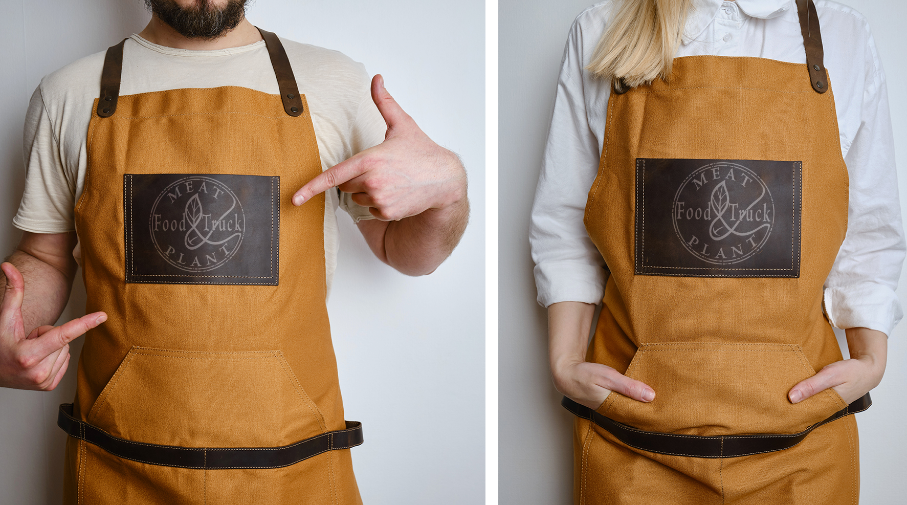
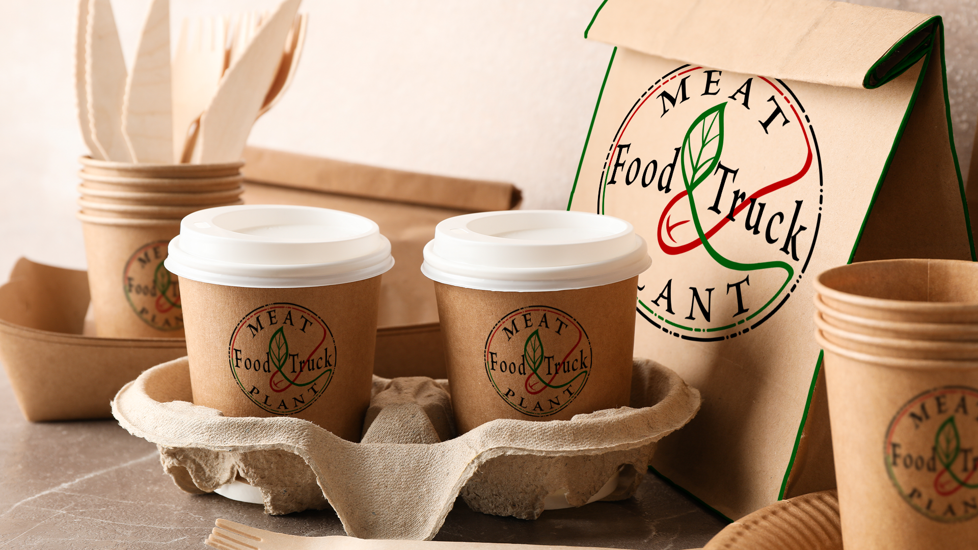
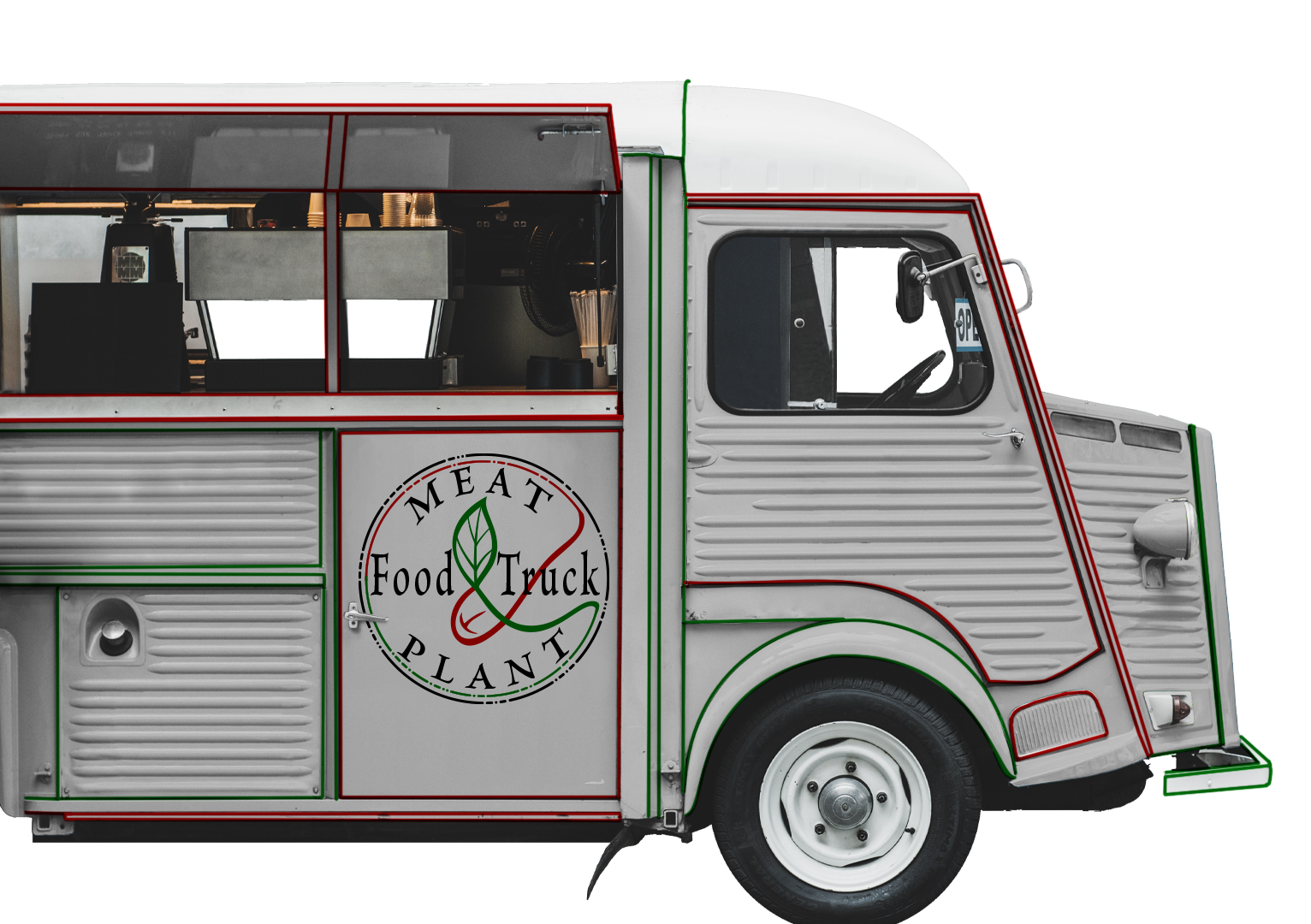
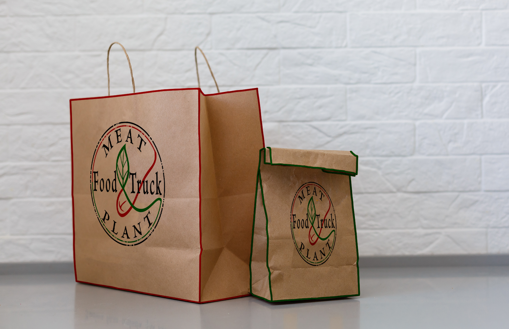
I applied the logo in the middle of various bags and mugs. I didn’t want to make it too flashy. To give the applications a bit more connection to other products and the brand, I gave the edges of e.g. bags and the food truck itself accents in the same red and green that I chose for the logo
I wanted the website to reflect the expensive and restaurant-quality part of the food truck. This generally meant a color scheme and whitespace. I have a large central box that contains all parts of the website, which gives white areas at the edges. I divided the aspects I wanted to give a difference between the different layers, so for each step inward I made the fill color a little lighter. I used the red and green for the stroke of the boxes, like the publication, as a consistent feature through all applications of the food truck’s visual identity.
Per instructions, my teacher did not want us to use Lorem ipsum to fill our dummy text and I therefore used text from a random Wikipedia article.
I wanted the publication to be clean and a bit luxurious. This meant that I wanted to have few
distracting elements. I created several pages so that all aspects of the publication could be
displayed; recipes, portraits of their suppliers, and essays, as well as collages of images.
Images used are from Adobe stock photos
I chose to make parts of the background dark gray to discreetly break up the dull monotony created by the white background. Red or green borders were used around images, as well as lines on the pages and under titles, to connect all pages of the publication with the food truck, especially with the color.
I use “Brioso Pro” in the publication to connect the publication with the logo and thus Meat & Plant. For the body text I use “Times New Roman” mostly because it is a common font that is suitable for body text, and it is a serif font which makes it vaguely match Brioso Pro. There are six different paragraph styles that you can use in connection with the publication.
Main heading = 48pt bold
Subheading = 48pt medium
Subheading = 24pt medium
Ingress = 14pt medium
Smaller text = 14pt bold
Body text = 12pt Regular
| Hex: 000000 | Hex: 1d1d1d | ||
| Hex: 252525 | Hex: 2d2d2d | ||
| Hex: 00720b | Hex: c10000 |